

 BBC
BBC
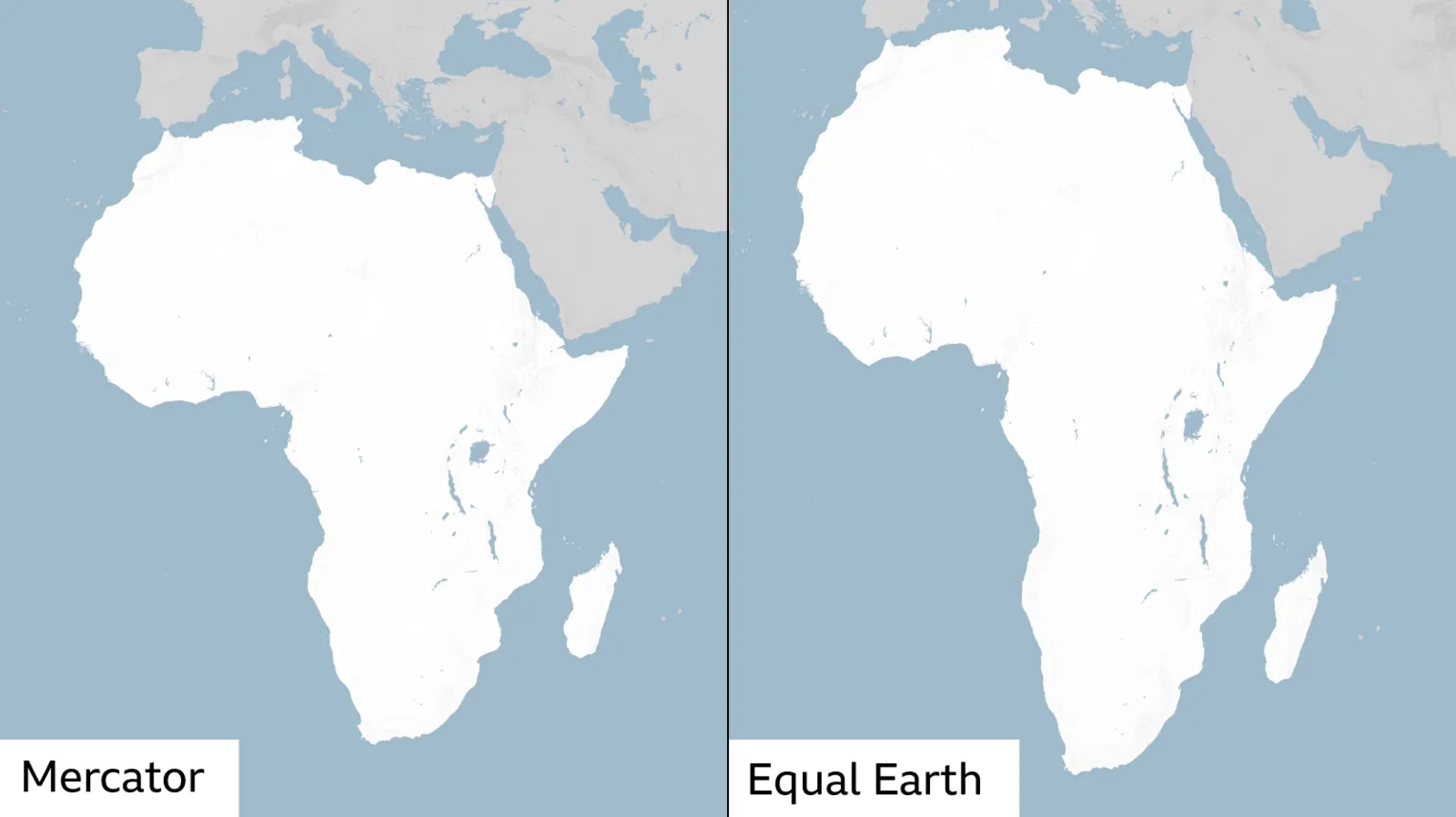
The UN has just called for the predominant world map to be replaced with one that more accurately reflects the true size of continents such as Africa.
The "Correct the Map" resolution adopted by the General Assembly aims to fix the discrepancy with the Mercator map, in which the African continent is shown as being of similar size to Greenland - even though it is in reality about 14 times larger.
The UN adopted a new map, the Equal Earth projection, which better represents the true sizes of landmasses - but comes with problems of its own.
There have been many prominent attempts over the years to solve the problem of accurately representing the surface of a sphere on a flat rectangle, each with its own benefits and drawbacks.
Mercator map
 Getty Images
The now widely used Mercator map was created in 1569 by Flemish cartographer Gerardus Mercator.
Its main purpose was to help European sailors navigate the oceans, as cartography Professor James Cheshire at University College London explained.
"He wanted a straight line to be drawn on a map to look like a straight line in reality if you followed a compass bearing," he told the BBC. "That was what it was intended to do, and that's what it does brilliantly well."
To keep those angles correct on a flat map, Mercator had to stretch the grid lines wider as they moved away from the equator toward the poles.
His map accommodates for the curvature of the Earth by making countries near the equator seem much smaller than they are and countries nearer the poles appear stretched.
The distortion is a result of it being impossible to accurately represent the surface of a globe on a two-dimensional chart.
More than 450 years on, Mercator's creation is still the basis for many of the maps we see in classrooms, on TV and online, including Google Maps.
But critics of the Mercator map say there is a psychological effect to viewing some places as smaller than they actually are and others as larger, as we instinctively view bigger things as more important.
For Kenyan geographer Kioko Muendo, this has implicitly downplayed Africa's vast resources, population and investment opportunities.
"Maps are more than just guides for travellers - they shape how regions are perceived politically and economically," he told the BBC.
Equal Earth map

The Equal Earth map aims to address this problem with the Mercator projection.
It was developed by a team of cartographers in 2018 to present the size and shape of landmasses more accurately, and was inspired by the 1963 Robinson projection - a map that shows the entire globe's surface at once.
As a result, the Equal Earth map was adopted by African Union members in February, before it was adopted by the UN.
But it sacrifices the straight lines that made the Mercator projection perfect for navigating with - and it cannot be used for measuring the true distance between different places.
"You can preserve area, or you can preserve shape, or you can preserve distance and direction, but not everything at once perfectly, because otherwise you'd be back to a sphere," Cheshire said.
Peters map


The Peters world map was designed by German historian Arno Peters in the early 1970s. The rectangular map is based on the projection first described by Scottish cartographer James Gall in 1855.
The projection sacrifices accuracy of shape in favour of accuracy of scale. So, polar regions are squished, while the bits near the equator are stretched.
This fixes the Greenland-Africa size issue, allowing those who use it to get a sense of the comparative size of different landmasses, all while preserving straight lines of longitude and latitude.
However, the map severely distorts the shapes of Earth's landmasses, making them all look slightly off. Russia, for instance, looks much smaller than it actually is.
The straight lines on the Peters map also do not represent true constant compass bearings and so are useless for navigation.
Flipped and shifted maps
 Universal Images Group via Getty Images Images
In the same way the apparent size of a landmass can influence its perceived importance, so can its prominence on a map.
Some cartographers have attempted to orient the map so the south is at the top, to counter the psychological bias that comes from the global south being viewed as less imporant because it's lower down.
And depending on where you are in the world, which continent is placed in the centre of a map can vary.
While these alternate maps offer a different perspective on the world to the one we may be familiar with, they don't solve the issue of prominence, but rather simply change the focus of a map.
Polar-oriented maps
 NurPhoto via Getty Images
One way of resolving the issue of which landmass is at the centre of a map - and therefore the most prominent - is putting none of them at the centre.
This is what the map in the UN logo does: the world is centred around the North Pole, with the continents radiating outward from it.
It's known as an "Azimuthal equidistant projection", placing world regions on a circular map around a focal point. The further away from that point on the globe, the bigger the circle.
On this type of map, all points are at the correct "azimuth" - or horizontal direction - from the centre point.
But to fit the entire surface of a sphere onto a circle, the map becomes more distorted the further away from the centre it gets.
On the UN map, for instance, areas near the South Pole appear squished and stretched as what would be a ring of the same circumference as one around the North Pole becomes much larger.
SOURCE/AUTHOR : BBC NEWS/Jaroslav Lukiv
Venues










'I will never let your legacy die' - Charlie Kirk's widow gives tearful address after shooting






One hellscape to another: Gazans tell of dire conditions in Israeli-declared humanitarian zone


Israeli forces near Gaza City centre as Hamas reportedly prepares for street-to-street fighting





Soldiers threaten to seize state TV in Madagascar, presidency says, amid warnings of coup attempt


Israeli hostages and Palestinian detainees freed as Trump hails 'historic dawn' in Middle East


Israeli military's top lawyer resigns over leak of video allegedly showing abuse of Palestinian detainee




Israeli military's ex-top lawyer arrested over leak of video allegedly showing Palestinian detainee abuse




Bondi gunmen threw explosives at start of attack and practised shooting weeks before, police allege



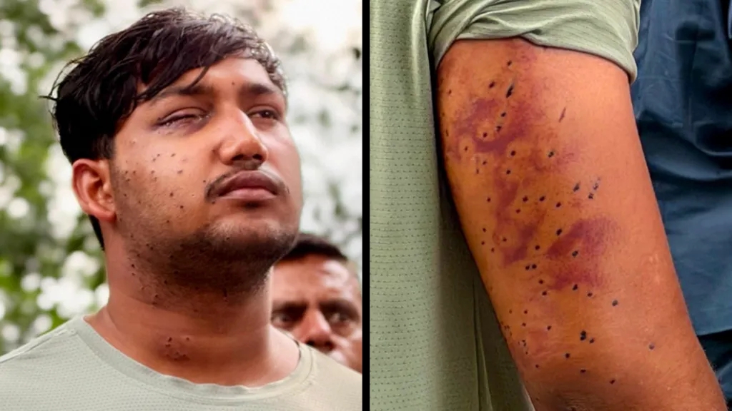
CJP protest: India's 'Cockroach' protesters have wounds consistent with pellet-gun fire, experts say



Iran says it is in talks with Oman but not the US after Trump says negotiations to resume





Ethiopia's Addis Standard: Editor of top independent news site seized by police, publisher says























Israel confirms soldiers fired at car in which Hind Rajab was killed and opens criminal investigation




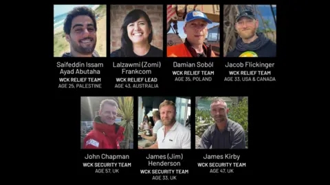
UK, Canada and Australia condemn Israel for refusing criminal probe into aid worker killings in Gaza


Iran faces 'greatest financial offensive ever', says US Treasury Secretary Scott Bessent



Chinese-Eswatini relations: China advises its citizens to leave Taiwan ally over security risks





Iran says US strike killed four at wedding in 'war crime' as US denies targeting civilians











Russia hits Ukrainian train shortly after Boris Johnson and top European officials leave station






German state elections: Chancellor Friedrich Merz vows to stay on despite 'disaster' in polls



Trump threatens to 'annihilate' Iran in UN speech as officials from both countries meet on sidelines

Russia-Ukraine war: Moscow targeting 'ordinary life' with attacks on data centres, Zelensky says



Comments (0)
No comments yet. Be the first to comment!
Leave a Comment